
Clarity matters more than creativity: 7 lessons for church creatives
Seven communication lessons for church creatives: prioritize messages, cut clutter, write for visitors, repeat with purpose, and always give a clear next step.
Most church creatives are taught how to make graphics.
Far fewer are taught how to communicate clearly.
We learn the software, follow the trends, choose the fonts, and try to make every announcement look important. But good church media is not measured by how impressive it looks. It is measured by whether people understand what matters and know what to do next.
A beautiful design cannot rescue a confusing message. More information does not always create more clarity. And repeating something is not a failure when people genuinely need to hear it again.
These are seven lessons many of us had to learn the hard way.
1. Clarity matters more than creativity
Creativity gets attention, but clarity helps people understand.
A design can be original, beautiful, and technically impressive while still failing to communicate the message. The colors can be perfect. The type can feel premium. The illustration can stop the scroll. And someone can still leave unsure what you were asking them to do.
Creativity should strengthen the idea, not make people work harder to find it. If a guest has to decode the layout before they can read the invite, the design got in the way.
That does not mean every graphic should look plain. It means the message comes first. Title, date, and next step should be obvious at phone size. Your sermon graphics, social posts, and slides only succeed when the words land.
If you are choosing between a clever layout and a readable one, choose readable. You can always add style after the communication is clear.
2. Not every announcement is equally important
When every announcement receives the same size, placement, urgency, and promotion, people stop knowing what deserves their attention.
Your church probably has more than one good thing happening this month. Small groups. Serve teams. A family night. A membership class. A missions offering. If each one gets a hero graphic, a Story series, a lobby poster, and a stage slide, nothing feels primary.
Good communication requires prioritization. Some messages need the stage. Some need social media. Some only need an email or a calendar listing. That is not neglect. That is leadership.
Before you open a new file, ask which one or two messages must win this week. Give those the strongest design energy. Let quieter updates stay quiet. Your congregation can only hold so many “important” asks at once.
3. More text rarely means better communication
The graphic does not need to answer every possible question.
It is tempting to load the post with every detail you have: schedule blocks, rain plans, allergy notes, volunteer shifts, parking maps, QR codes, and a paragraph about why the night matters. The intention is kindness. The result is noise.
Give people the essential information and one clear next step. Put the full description, policies, schedules, and additional details on the registration page where they belong. The graphic’s job is to invite. The page’s job is to explain.
Too much
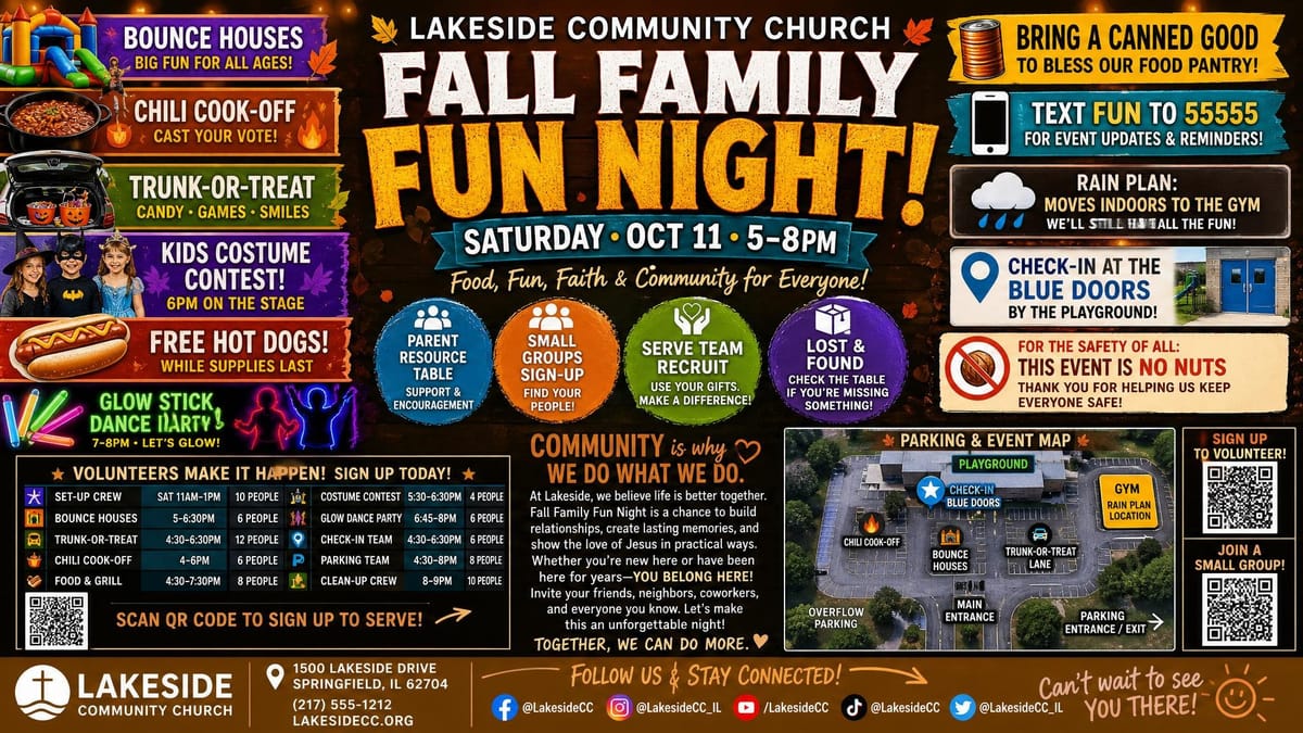
One job
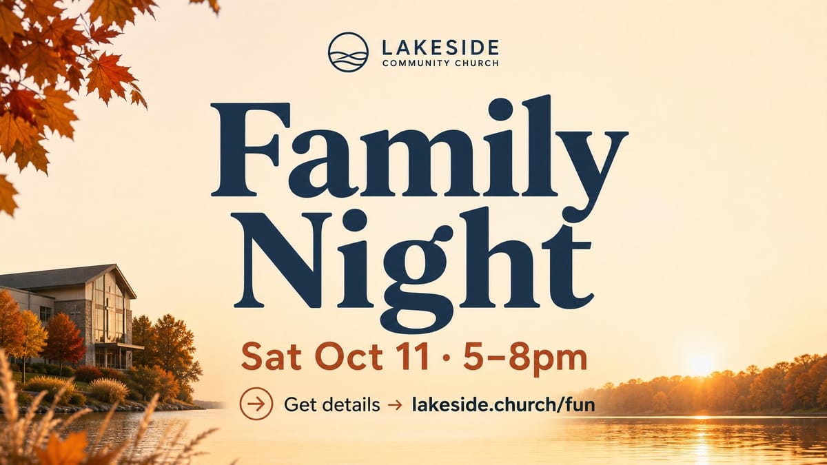
If the post looks like a brochure, move half of it off the graphic. The same habit helps announcement slides stay readable from the back row. People should catch the invite in a glance, not study it like a handout.
4. A graphic cannot fix a confusing event
Design cannot clarify decisions that the ministry has not made.
If the team is still debating the name, the audience, the start time, or whether registration is required, no amount of polish will save the post. You will redesign it three times, and guests will still ask the same questions in the lobby.
Before creating the graphic, lock the brief:
- Who is this for?
- What is it called?
- Why does it matter?
- When does it happen?
- What should someone do next?
Protect your designers and volunteers here. A five-minute brief saves an hour of redesign. Better design cannot replace a better decision. For event workflows, see church event graphics.
5. Your church speaks a language visitors may not understand
Ministry names, abbreviations, and internal phrases may make perfect sense to your staff and longtime members.
“CG in the FLC.” “CKC tags.” “Dream Team.” “Encounter.” “HYC.” Those shortcuts feel efficient in a staff meeting. On a public invite, they can make a first-time guest feel like they walked into the middle of a conversation.
A first-time guest should not need insider knowledge to understand an invitation. Clear language helps more people feel included before they ever arrive.
Write the first draft as if a guest is reading it on a phone in the parking lot. If a title only works for people who already know your systems, rewrite it. You can still use the ministry name in the details. Lead with plain words first so someone knows what is happening before they learn your vocabulary.
Here is how insider language often shows up next to a clearer rewrite:
Do
- “Kids classes for ages 2–5 during the 10am service. Check in at the Welcome Desk.”
- “Join a small group this fall. New groups start the week of Sept 8.”
- “Serve with our Sunday hospitality team. Sign up after service.”
- “Middle and high school hangout Friday at 7pm in the youth room.”
Don't
- “CG is in the FLC. See a Greeter for CKC tags.”
- “Life Groups relaunch in the Connection Center after Encounter.”
- “We need more people on Dream Team / First Impressions.”
- “HYC + MS hang. Doors at 6:45. Bring your people.”
6. Repetition is not always annoying
Your team may be tired of promoting an event long before most of the congregation has noticed it.
You have seen the graphic twelve times in review. You posted it once on Tuesday. By Thursday you feel done. Meanwhile half the church missed it, a third glanced past it, and a few saved it for later and forgot.
People miss posts, arrive late, forget details, and need reminders. That is normal. Repeat the message while changing the angle, visual, story, or call to action so the reminder still feels useful.
A church social media content calendar helps you plan those reminders without flooding the feed every day. Consistency is not spam when the invite still matters and the next step is still clear.
7. A beautiful post without a next step is unfinished
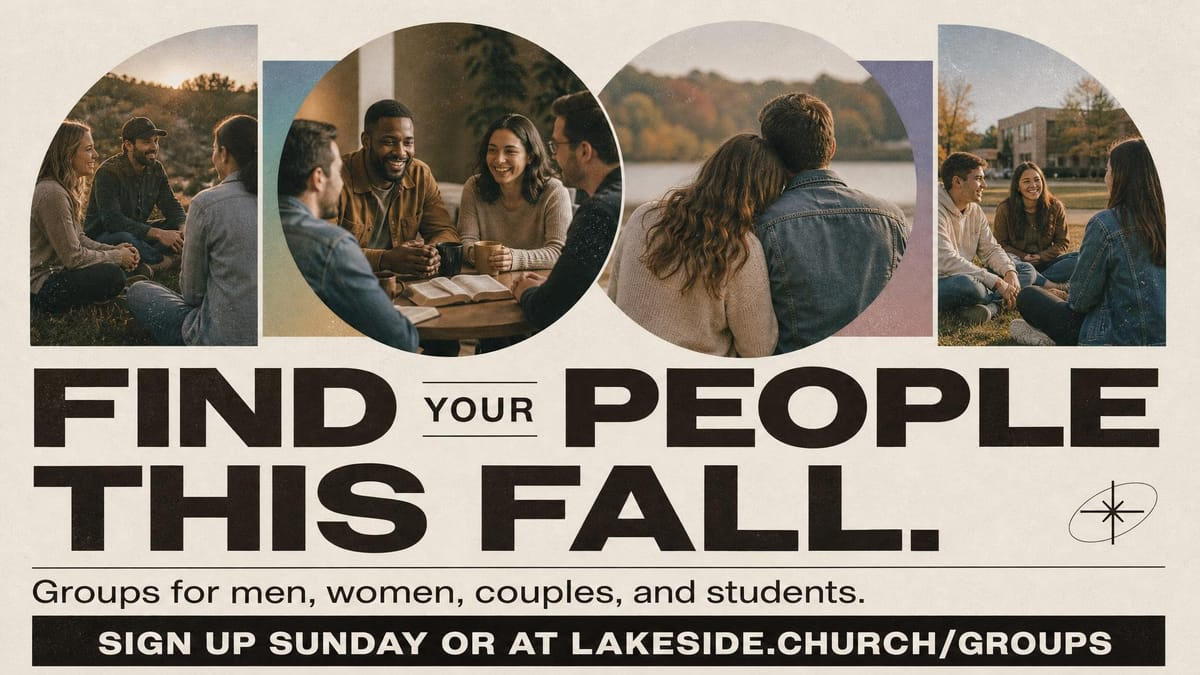
Attention is not the same as action.
A post can look sharp and still leave people hanging. They liked the photo. They felt the vibe. Then they scrolled on because nothing told them what to do.
After someone sees the graphic, should they register, attend, invite someone, save the date, visit a page, or send a message? Make the next step obvious instead of assuming people will figure it out.
If the next step is soft, the post is decoration. If the next step is clear, the post is communication.
Design that serves the message
The goal is not simply to produce better graphics.
The goal is to help people understand what matters and know what to do next.
When design serves the message, church media becomes more than decoration. It becomes useful communication.
Which of these lessons has made the biggest difference in how your church communicates?